In which I document a rather embarrassing mistake.
Sometimes, even in the midst of an epiphany, one can be a little distracted. Such was the case over a year ago, when I was contemplating the joys of flight— instead of paying attention to the type I was setting.
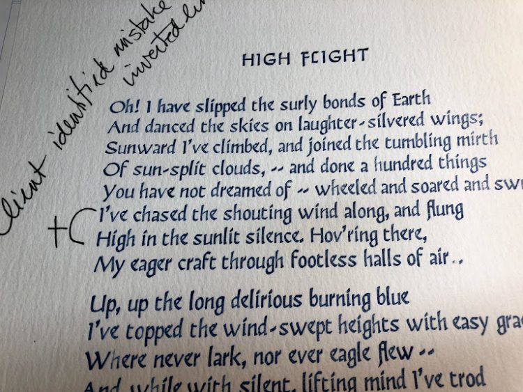
To establish the proper measure, I’d set the longest line of McGee’s poem first. I then proceeded to set all the other lines of the poem — and felt rather smug that I’d managed to set all the words right despite my Christmas haste. Little did I realize while daydreaming with my head in the clouds, that I’d mis-ordered the sequence of lines in the first stanza.
None the wiser, I happily wrapped up the first print as a Christmas gift for a certain young pilot (who’s clearly too well brought up to mention the mistake) and listed the remaining copies with my Etsy store. (I did think it a little peculiar that none of the prints were selling; I’m usually able to sell at least a few broadsides to help cover my paper costs.)
Thankfully, one of my eagle-eyed Etsy clients recently noticed the error and gently pointed it out. To say I was mortified would be an understatement! Scrap that edition and back to the type bank.
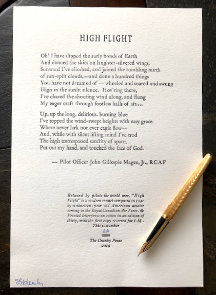
It’s only taken a year to get it right, but here it is. McGee’s perfect words in the order they’re meant to be. The mistake has humbled me – but I realize that my little print shop continues to teach me many important lessons. Patience, concentration, focus — and the luxury of time.
Beautiful work ! I empathize with your mortification. What Typeface have you used for it.?
Thanks, Paul. I set the original version with Jim Rimmer’s Fellowship foundry cast type (24 pt). I used Bembo (18 pt) for the second, corrected version. I love the ligatures in that face and was a little disappointed there wasn’t more occasion to use them in the poem. Still, even in mistakes and embarrassment, there’s always something to be learned.
I’ll be using Caslon on our Ludlow for my ‘stolen’ version at the Dardanup Heritage Park Print Shop. I agree that some copy doesn’t take advantage of all the beautiful ligatures. Beautifully crafted! From your Typophile, PeterGriffin
Caslon has some lovely ligatures — and I envy your access to the Ludlow! There have been times when I’ve actually looked for texts to print based on the number of ligatures I can include. Hardly a noble approach to my chosen texts — but I usually come to my senses. 🙂